
Brand identity
Call Time
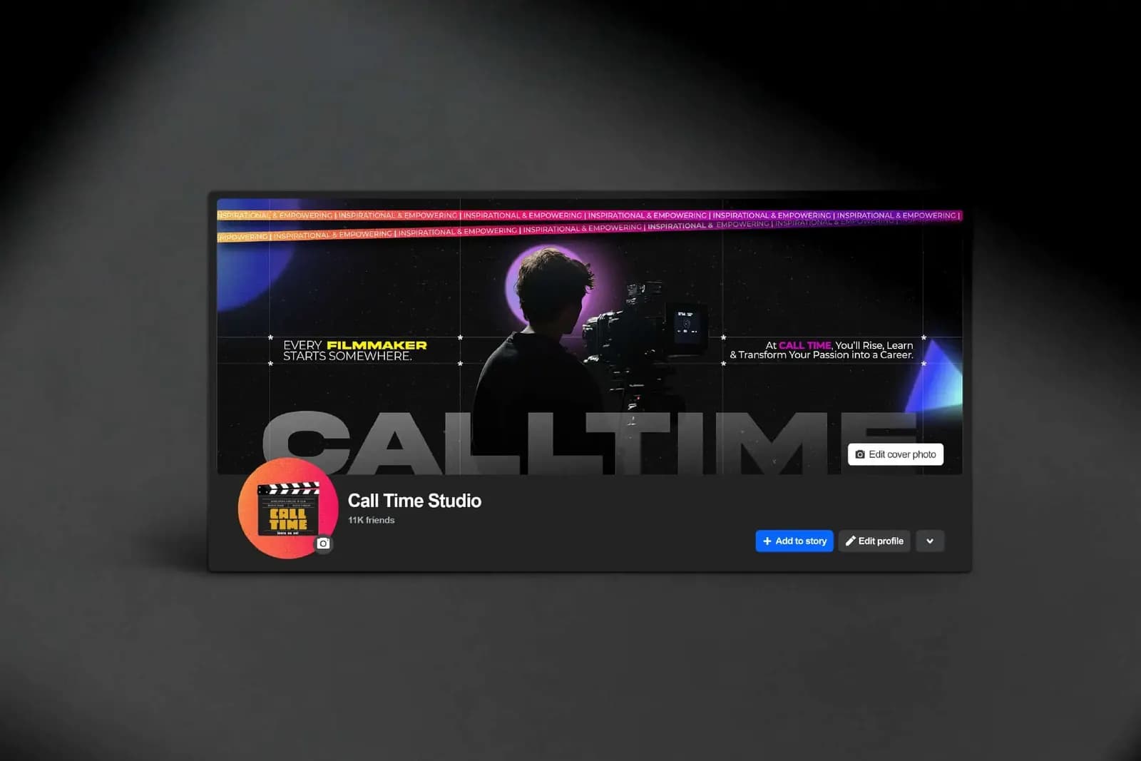
Call Time Studio needed an identity built around clear communication, professionalism and innovative design. We created the visual identity and positioning, then applied it across stationery, merchandise, social posts and outdoor graphics.
The brief
The studio wanted a brand that stands for clear communication, professionalism and innovative design, in a tone summed up as where clarity meets connectivity.
The approach
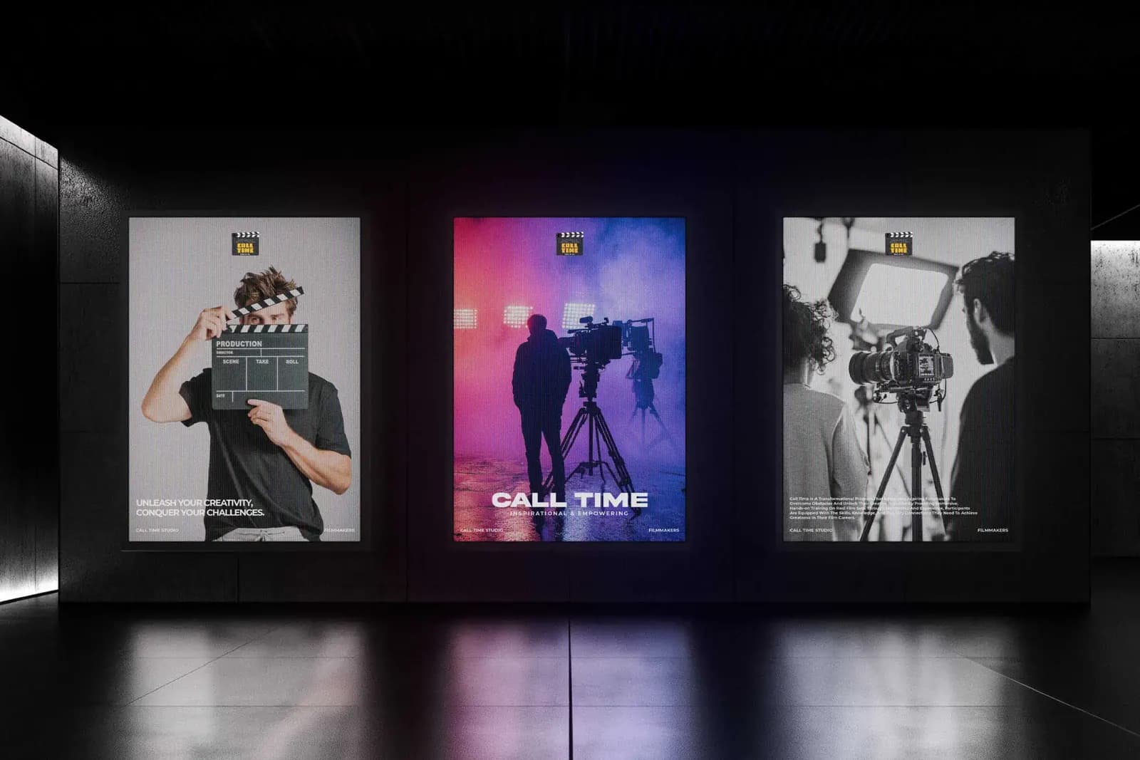
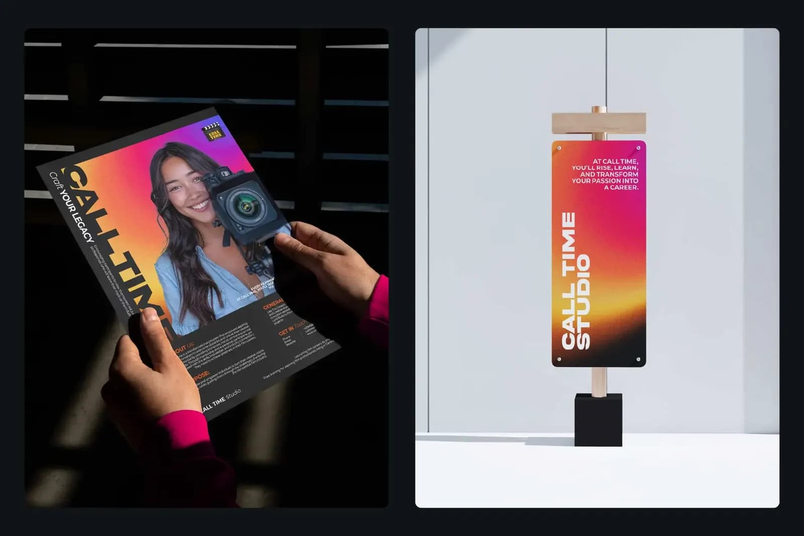
A warm gradient of pink, orange and yellow sits against black, with bold typography and restrained layouts. The same look runs across every item, from small cards and badges to large posters and screens.
What we delivered
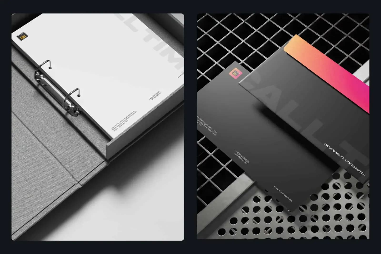
The identity plus a full set of applications: a business card and letterhead suite, branded apparel and accessories, outdoor banners and LED display graphics for high-traffic locations, and the social, poster and channel artwork shown in the gallery.
The work



More work
- NayaSource · Branding and UI/UX design
- Framily Adventures · Branding and UI/UX design
- All projects