
Branding and UI/UX design
Framily Adventures
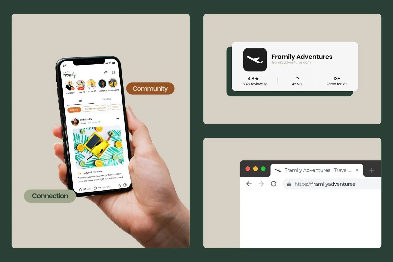
Framily Adventures wants solo travelers to meet people and keep the friendships after the trip. We created its brand identity and designed the app and web experience across mobile, tablet and desktop, with motion design and front-end and back-end development.
The brief
Framily set out to change how people travel alone. The brand and the product needed to express transformation, community and belonging, so that strangers feel comfortable becoming travel companions.
The approach
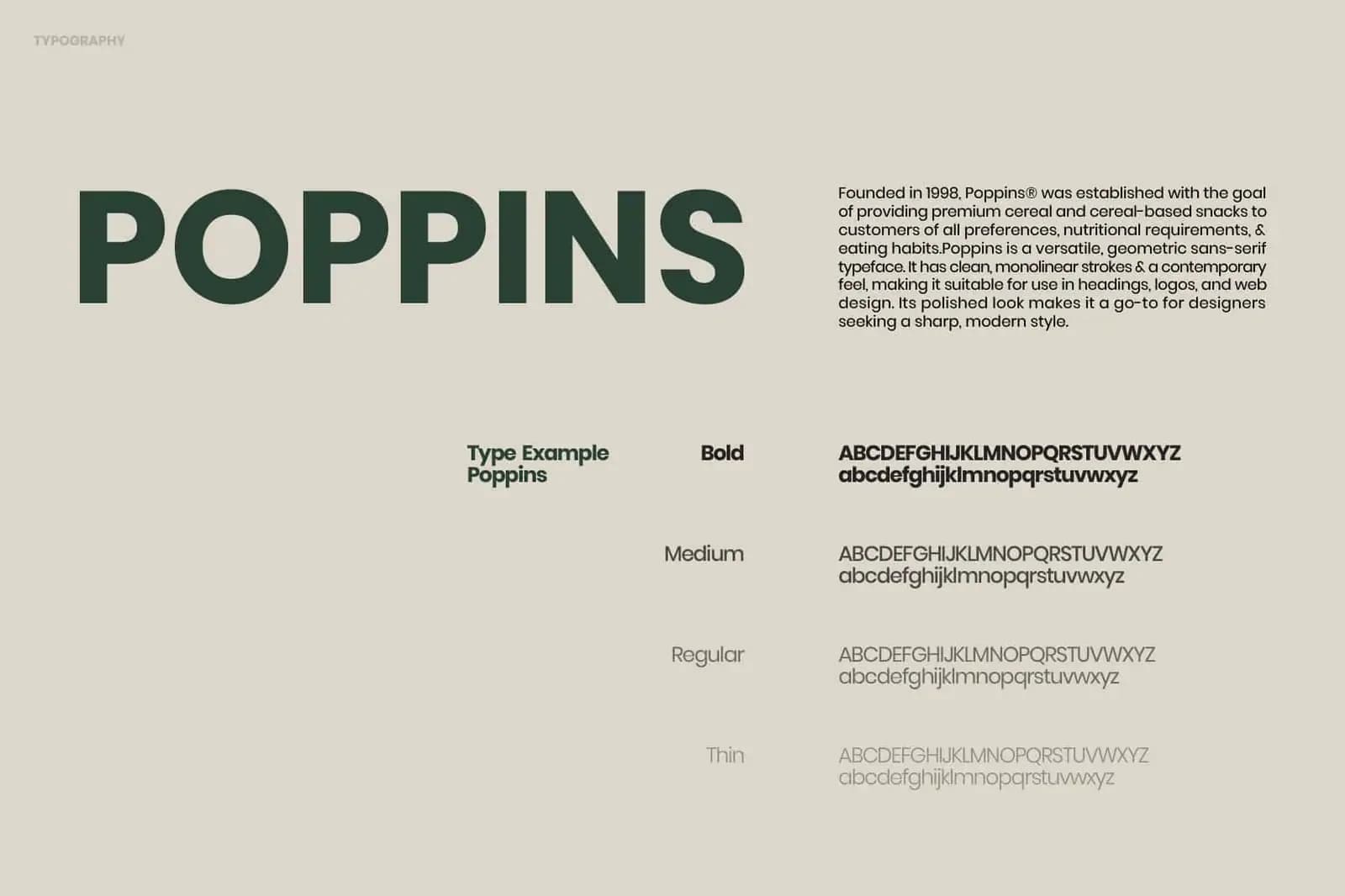
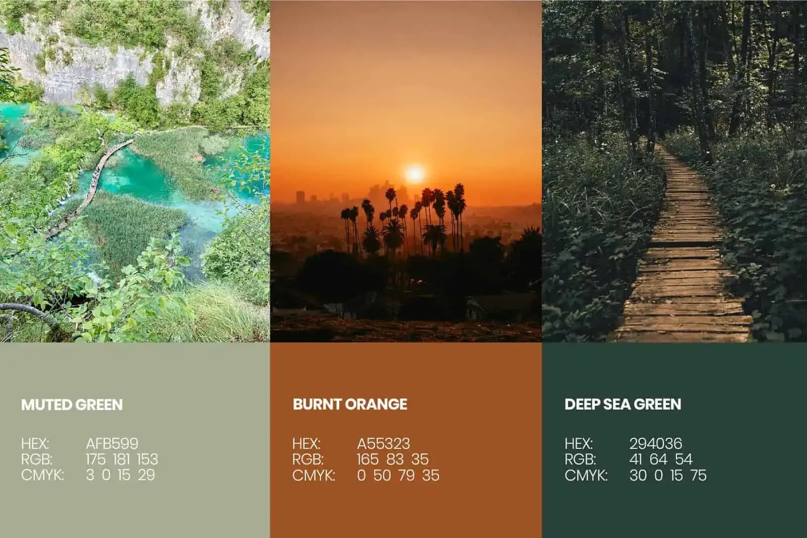
The look takes its cue from early internet message boards and blends that nostalgia with a modern, premium finish. Three colors do most of the work: a muted green for calm, a burnt orange for warmth and energy, and a deep sea green for depth. The typeface, Poppins, keeps text friendly and easy to read.
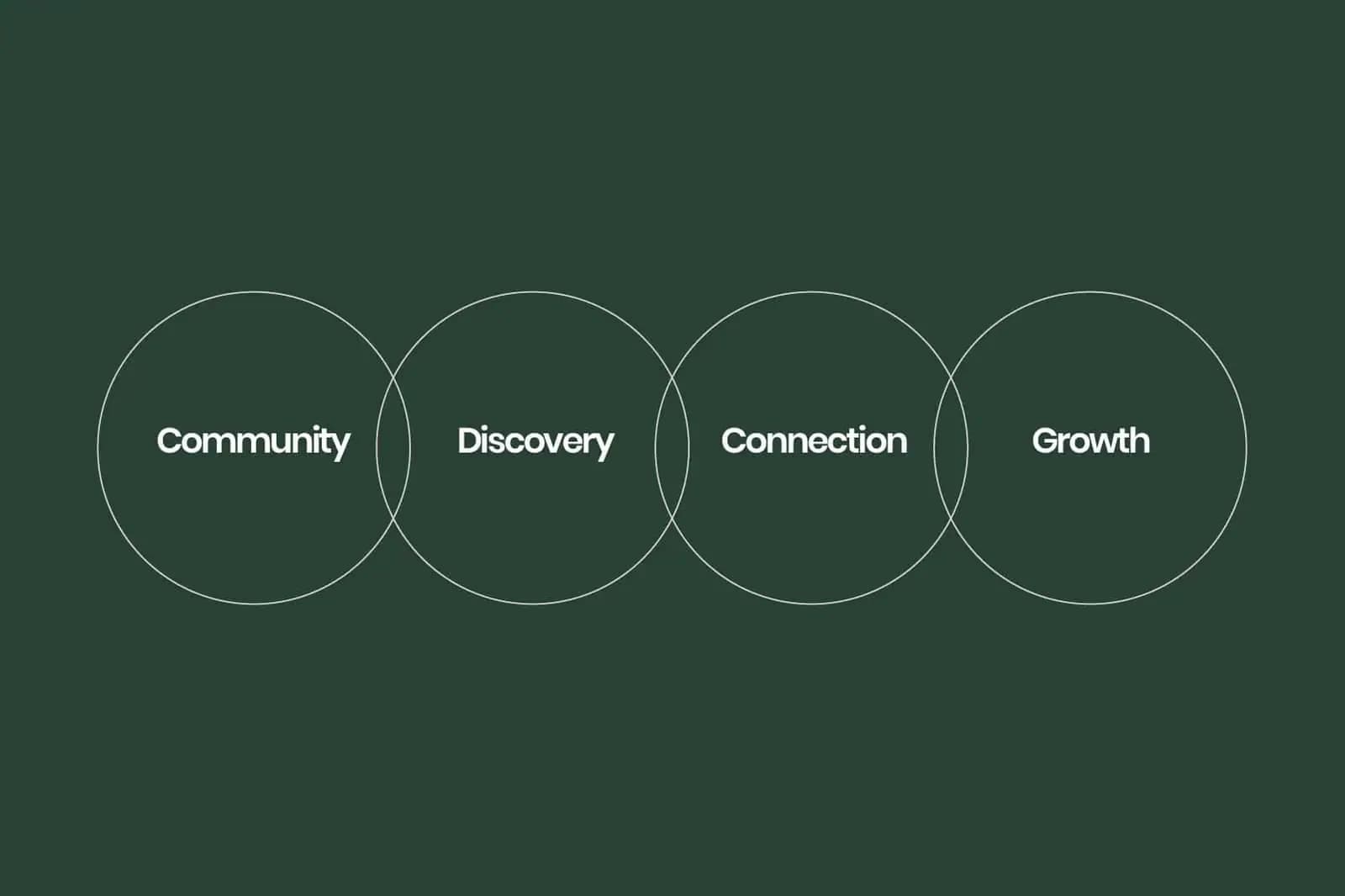
The identity is organized around four ideas: Community, Discovery, Connection and Growth. They guide the visuals, the social templates and the app experience.
What we delivered
A full identity system, the app and web interface, and the applications shown in the gallery: social templates, an outdoor billboard, transport branding, merchandise and the logo adapted for a smartwatch face and caps.
“Travel isn't just about the places you go, it's about the people you meet along the way.”
The work



More work
- NayaSource · Branding and UI/UX design
- Call Time · Brand identity
- All projects