
Branding and UI/UX design
NayaSource
NayaSource connects businesses with dependable overseas suppliers. We designed its brand identity, the interface for its website and app, and the printed and digital touchpoints that make the brand feel consistent everywhere a customer meets it.
The brief
Buying from suppliers in other countries can feel risky. NayaSource wanted a brand that signals trust and global reach and makes B2B procurement feel simpler, in a warm tone rather than a corporate one.
The approach
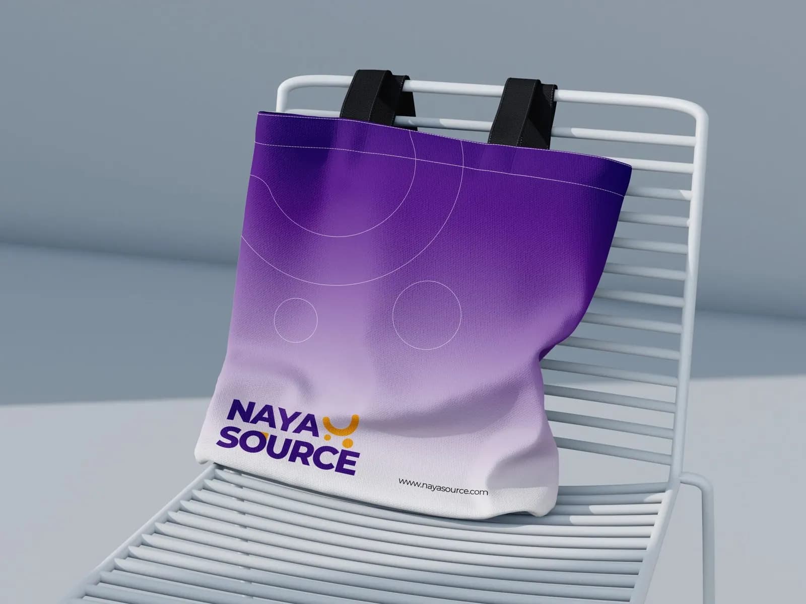
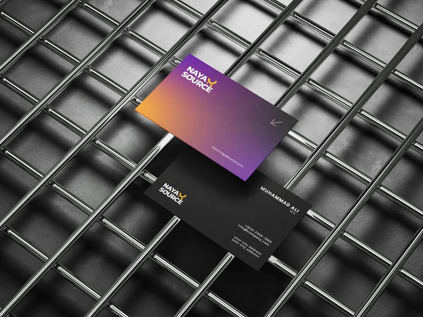
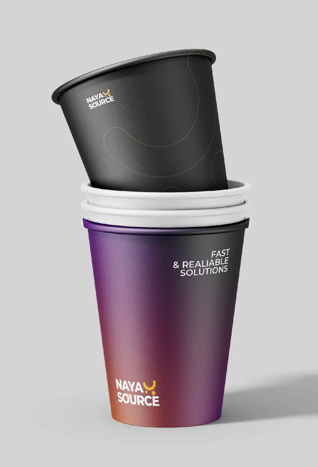
The identity is built on a purple-to-orange gradient, chosen to suggest reach and energy, paired with clean, modern typography that keeps it credible for business buyers. The same gradient runs through the logo, social posts, cards and packaging, so every item reads as one brand.
On the product side, the UI and UX work focused on making each step of finding and contacting a supplier clear, so the interface supports the promise in the brand.
What we delivered
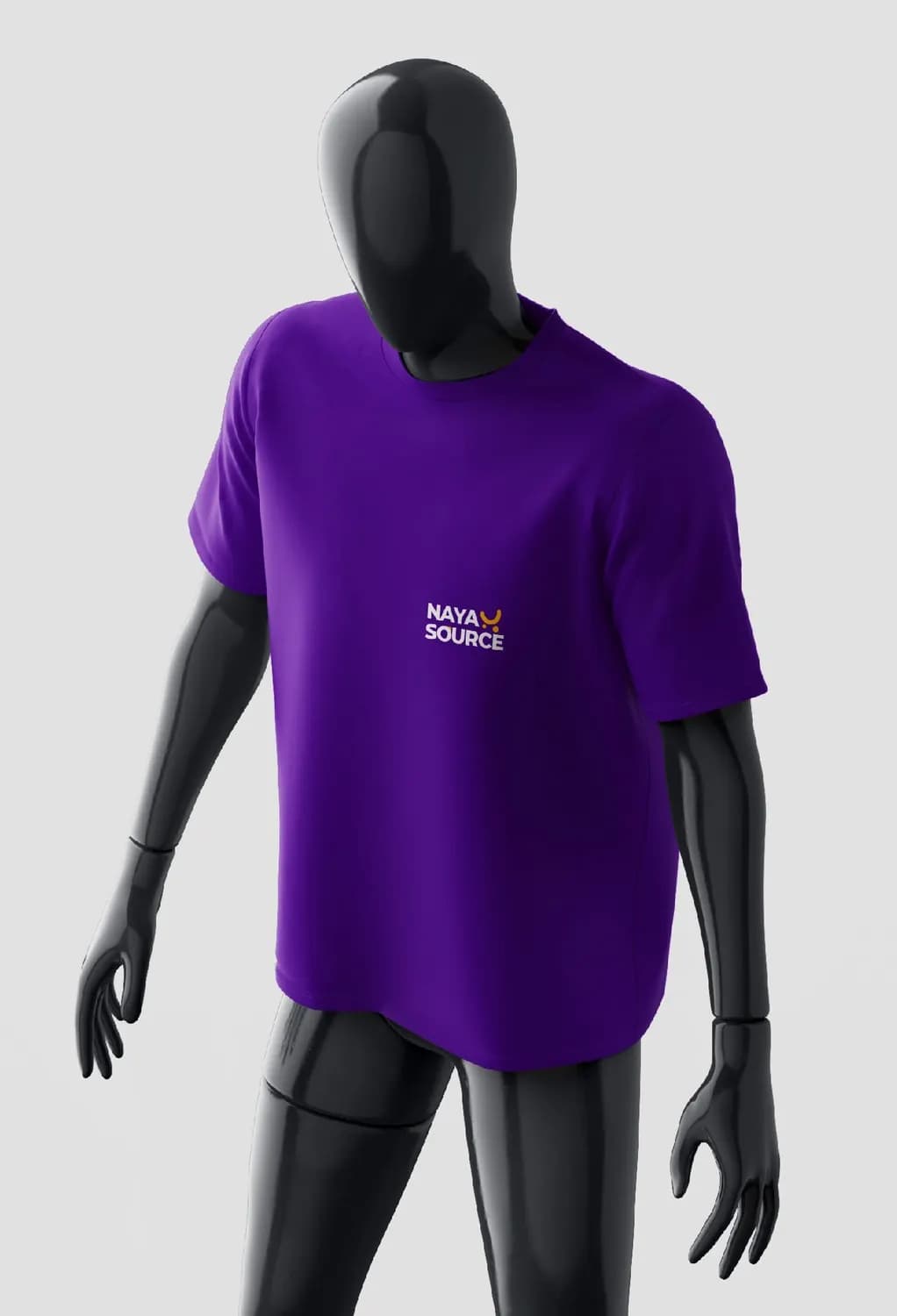
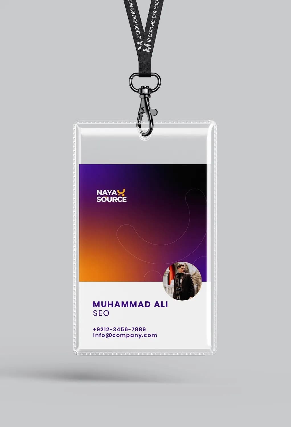
A complete identity system plus the touchpoints below. The gallery shows the applications: social posts, a tote bag, business cards, a branded t-shirt, an employee badge and cups.
The work

More work
- Framily Adventures · Branding and UI/UX design
- Call Time · Brand identity
- All projects